An official government website of the Kingdom of Saudi Arabia:

This slogan is derived from the Kingdom's Vision 2030, a national strategy focused on human beings and their technological knowledge. This strategy has made digital education an approach to comprehensive development, represented by the university's values and progressive thinking, which moves away from stereotypes and toward the horizons of true, continuous creativity for its students and academic cadres, who represent the backbone of university digital transformation in the Kingdom.
This artistic blend reflects the significant technological advancements laid by the modern Saudi state and its vision, which hinges progress in all fields on achieving a technological breakthrough. The logo thus becomes an expression of the university's philosophy and the Kingdom's comprehensive vision for the stages of digital development.
Meanings of lines in the logo
The logo consists of six main lines that represent the university's strengths, converging in the middle to form a map of the Kingdom. The complete circular shape reflects continuous, tireless movement.
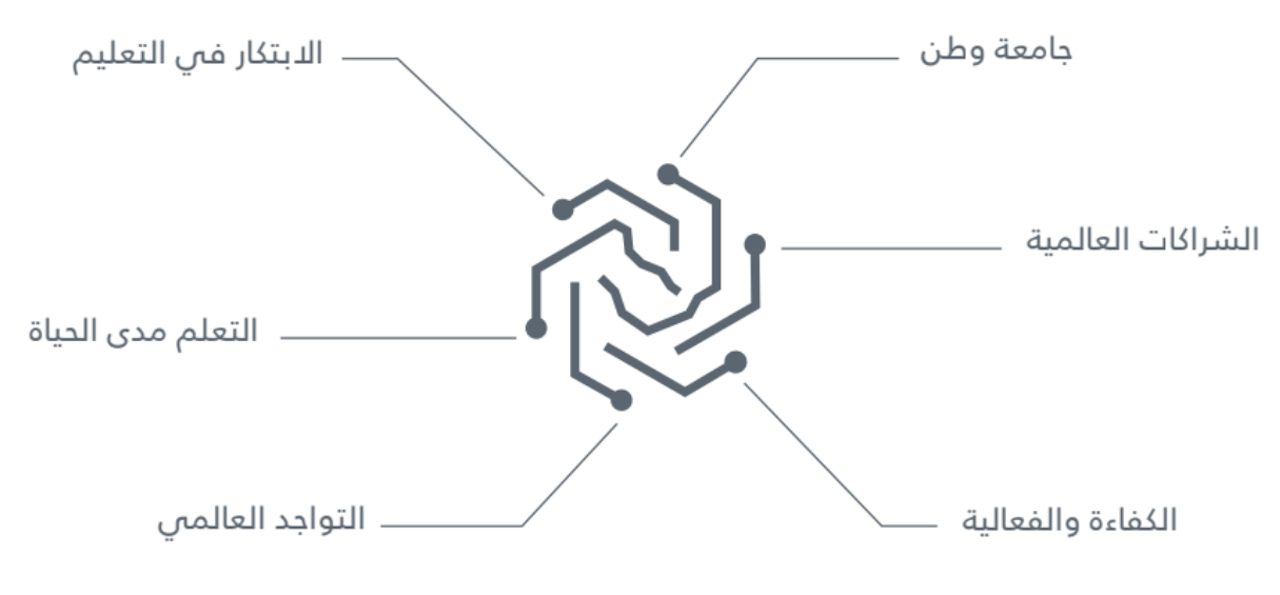
Color philosophy and lines used

- Purple: A blend of blue and red. Its connotations: ancient wisdom and creativity, and modern technological advancement.
- The combination of similar colors: indicates the integrated technological renaissance between the branches and types of modern and advanced knowledge.
- Zigzag semicircles: represent the connection between types of knowledge, and their integration into a neural technology chain similar to the nerve endings in the human body.
- The circles in their successive form: indicate the scientific and cognitive diversity that ultimately reaches the map of the Kingdom of Saudi Arabia, or moves from the center - Saudi Arabia - to the largest number - represented by the circle - of partners in science, wisdom, creativity, and technological development.
Vertical Format
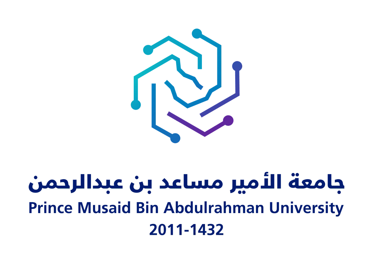
Horizontal Format

White Version
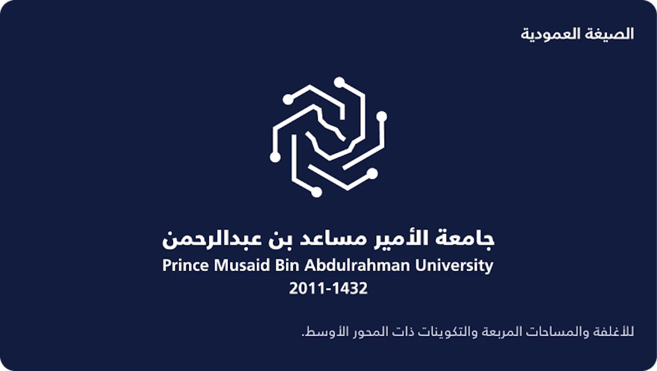
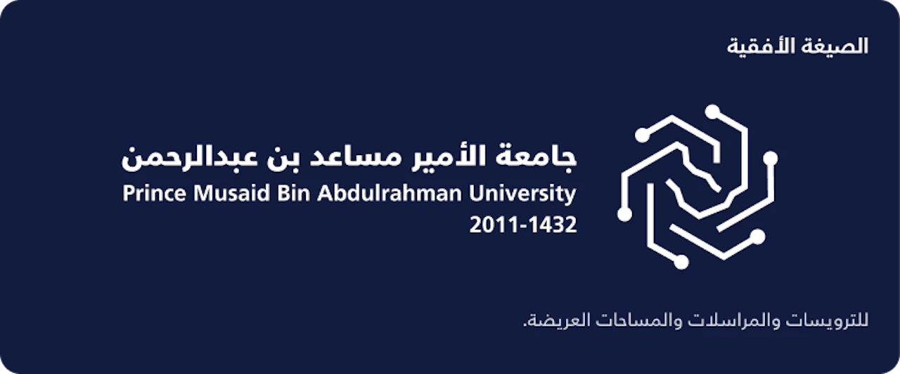
The logo appears entirely in white while maintaining the same proportions and composition.
A dark background should be selected to ensure all details remain clearly visible. The white version should not be placed on a light background, and no transparency, shadows, or outlines should be applied to its elements.
Proportions and Dimensions
A single unit of measurement defines the relationship between the symbol, the name, and the spacing.
H = 4X / X = H ÷ 4 / NAME WIDTH = 11X
The unit of measurement is equal to one quarter of the symbol’s height. The width of the name block is equal to 2.75 times the symbol’s height, with a spacing of one unit.
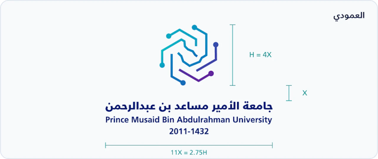
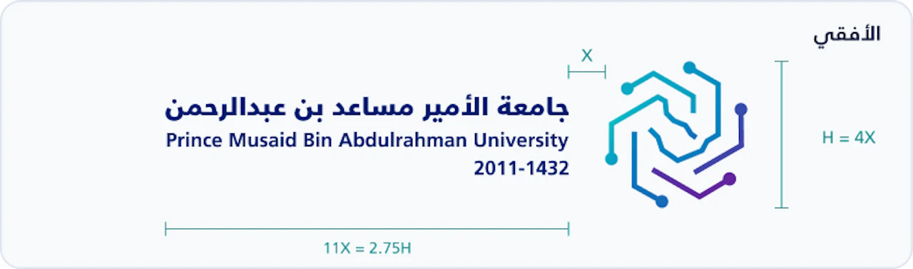
Overall Dimensions • Width × Height
|
Measurement |
Vertical |
Horizontal |
|
Aspect Ratio |
1.53 : 1 |
3.97 : 1 |
|
Digital Example: Symbol Height 160 px |
440 × 288.35 px |
635.28 × 160 px |
|
Print Example: Symbol Height 20 mm |
55 × 36.04 mm |
79.41 × 20 mm |
The dimensions refer to the artwork itself, excluding the clear space. The sizes shown above are examples, not minimum requirements; the logo should be scaled up or down proportionally.
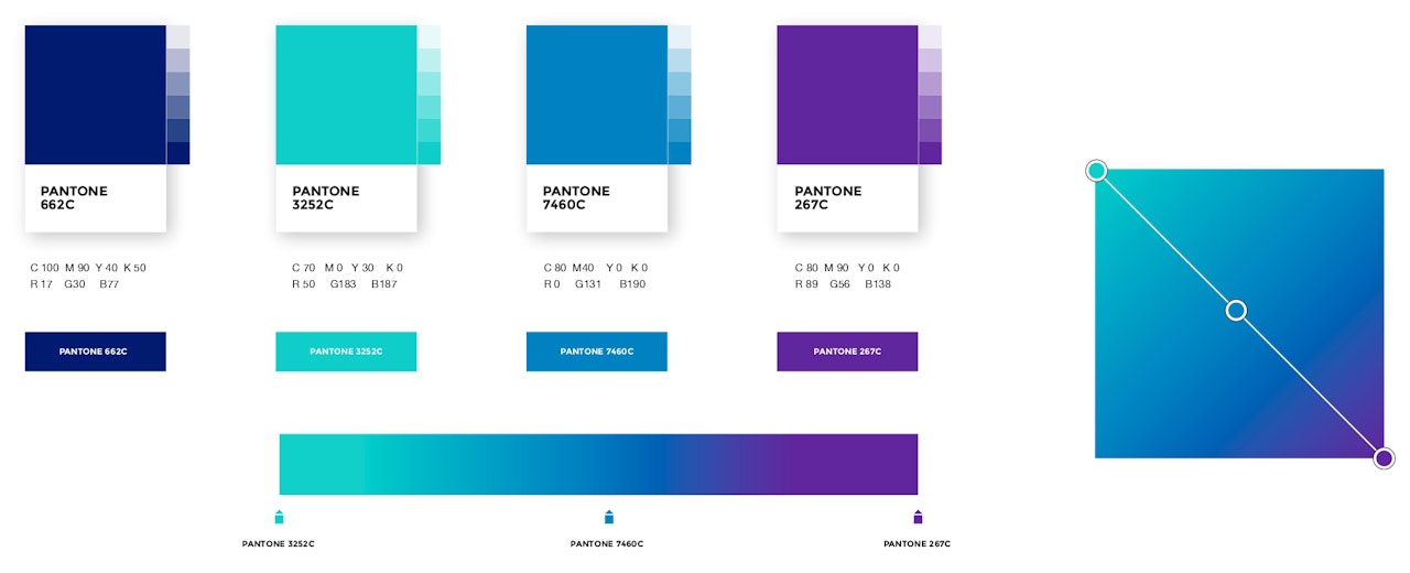
Secondary Color Palette
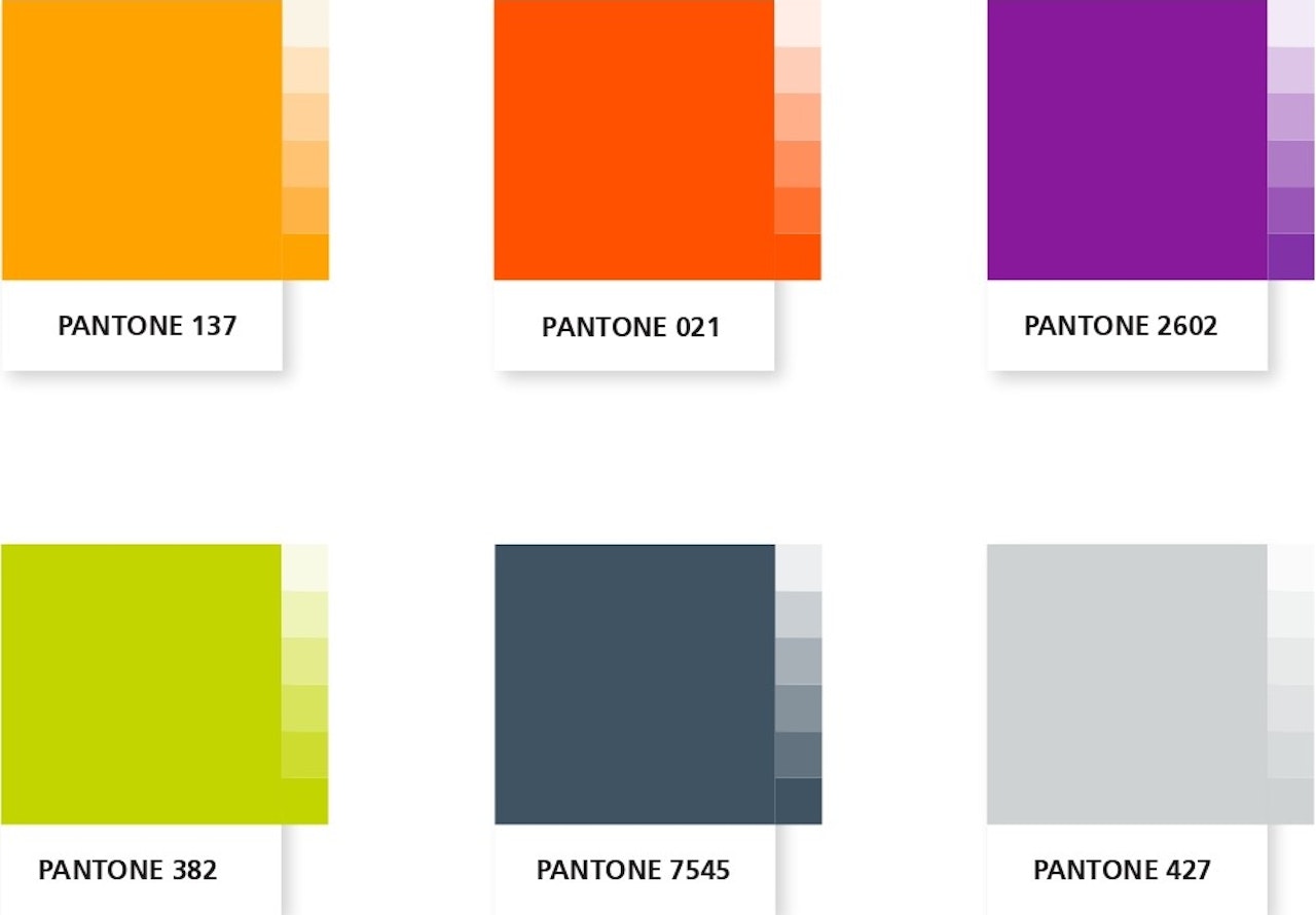
The secondary colors were chosen to align with the overall spirit of the logo. They are recommended for use in situations where alternative colors are needed to complement the primary colors to achieve specific design goals, such as sub-logo designs and infographic designs with a diverse awareness theme. This sub-color list gives the identity a dynamic and diverse feel, helping it stand out and providing creative space for design teams.